Does anyone ever actually expect to win in a giveaway? I enter, of course, but tend to immediately forget that I have because I don’t expect to win. Which is why I was very pleasantly surprised when I won the second prize in Amadea Kingdom’s giveaway. So of course I am going to tell you all about it.
About the Brand
Amadea Kingdom is a one-man brand run by @fairytaleprince. Based in Germany and with an Etsy shop, Amadea Kingdom offers clothing and accessories that focus on ouji styles, but that can work for so much more. The geeky influence in every design is obvious, yet presented in a stylish way with more of a fantasy twist than a pop one that you’d find in mainstream geek shops, which makes the pieces so easy to blend between J-fashions and vintage styles.
What I Got
Since I received all of this for free, it makes sense to dive straight into the meat of this review. For reference, second prize in the giveaway consisted of three wooden brooches from The Adventurer series: a D20 brooch and two faulty prototypes of D8 and D4.
 |
The box inside took a bit of a beating in postage, but the gift wrap held up very well.
|
 |
Simplicity is very elegant.
|
 |
Part of me wonders if the wax seal changes seasonally, since it was still sort of sakura season when this was sent.
|
 |
Totally in favour of wrapping brooches in paper doilies for extra protection.
|
The extra attention to packaging has certainly not gone unnoticed, I loved the doughnut gift wrap on the outside, as well as all the touches inside that blended the practical with the aesthetic.
 |
How well do the fairy stickers match the brooches though?
|
Did I mention that I always appreciate how independent creators go the extra mile to give you more than just the order? A few stickers and a bag of unique tea go a long way in making me feel appreciated - and I only got lucky with the giveaway, I’m grateful already for that alone! The fact that Amadea Kingdom is willing to do that for a giveaway speaks volumes about the treatment that paying customers can expect.
 |
Look at this texture, it adds so much character to a design that's already full of it.
|
Let’s start with the D20 brooch, which is possibly my favourite. Not that the other ones aren’t gorgeous, it’s simply that this design works with my own wardrobe best. The colours are rich and the lines crisp, I love how all the shades work together to create a harmonious, elegant composition. All of the brooches are large enough to be statement pieces, yet the more muted earth tones that dominate in the design mean that they could easily blend a little bit more if you want them to. This is the only fully matte design of the three that I have received and being able to see the texture gives it quite an antique look which would be perfect for classic lolita outfits. Or a forest elf one.
 |
The softer colour scheme of this one might actually make it easier for me to wear than the D20.
|
 |
A better shot of the glossy finish.
|
When I first took the D4 brooch out of its paper doily, I would never have been able to tell that this was one of the faulty prototypes. I totally forgot about that until I checked the giveaway post again. In comparison to the D20 it seems to be missing some of the outlining design, but look at it on its own and it looks like it’s been intentionally kept simpler. In fact what makes this brooch faulty in relation to what the final design is like creates a much lighter effect. The D4 brooch that was available for purchase looked a bit darker, whereas being able to see some of the bare wood in this design takes away some of those darker tones, replacing them with lighter colours. Particularly as this one has a shiny coating of (I assume) varnish, it doesn’t look unfinished unless you compare it to the D20 or to the final design.
 |
The more you look at this design, the more interesting details you notice about it.
|
 |
And again, a shot of the shine. It also lets you get a better look at the texture of that rose.
|
Of the two faulty prototypes the D8 was the slightly more obvious one. Though just like the D4, without comparing it to the stock pictures on Etsy, I could only have guessed what may have gone ‘wrong’ with this one. The effect on mine is, once again, much lighter, less saturated than the final design. The coating of varnish helps make it appear more intentional, so I seriously doubt that anyone would notice that something was wrong if I wore this on its own. Although I much prefer the overall design and colour schemes of the other two brooches, I can’t help but admire the depth in the design of the D8 one. The way the rose appears almost textured and the elegant pattern within the dice itself are subtle, yet captivating once you pay attention to them.
 |
Cleanly and securely glued backing.
|
Each brooch feels very sturdy. The backing pins are glued and there were no loose hot glue strings hanging off them. They all feel really well made and if I can say that about prototypes, then I’ve no doubts that all final products will be nothing less than this.
 |
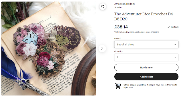
Screenshot taken the day before the preorder finished from Amadea Kingdom's Etsy shop.
|
At the time this review is going up, the pre-order period for The Adventurer brooches will have closed. They were available via Amadea Kingdom’s Etsy store for £16.35 each (approx. €20) or as a set of three for a truly bargain price of £38.14 (or approx. €45), which is almost three for the price of two. This is very much within the standard prices for wooden brooches, like my Milkribbon or
Madillustration ones. Amadea Kingdom also has beautiful sashes in a range of printed fabrics and available either with or without lace. If the quality of the brooches is anything to go by, the sashes will be fantastic too!
In other words, I would wholeheartedly recommend Amadea Kingdom. To make sure that you don’t miss out on any updates, I suggest following them on Instagram
@amadea.kingdom.


0 Yorumlar